Professional analytics platform

Read the structure, not the average.

Decompose price structure, keep a daily record of supply and demand, read how a neighbourhood is maturing, and connect street-level business activity to the property market. The layers a real decision needs, in one place.

20+Cities covered
NeighbourhoodSmallest unit of analysis
DailyMarket snapshots
5Analytics modules

01 · Market structure

Break down why prices differ.

Two identical 1LDKs can price differently by building age, station distance, ward, and the density of business around them. This lays those differences out in curves and tables you can compare.
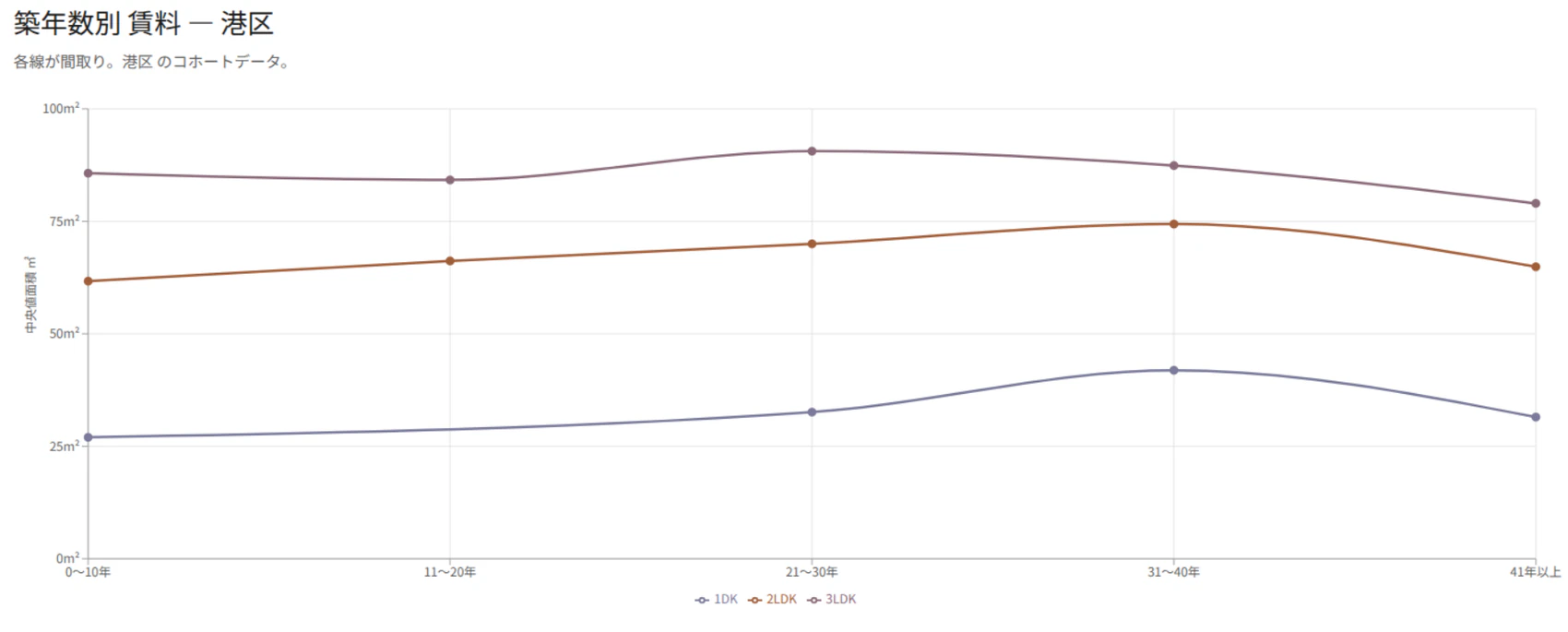
  • Age curves: read rent, size, and yield by building age, per layout.
  • Station sensitivity: compare walk minutes against price, area by area.
  • Ward premium: see a ward as a residual once location factors are stripped out.
  • Business density: tie the commercial cluster around a town to its prices.
Rent by building age · MinatoAge × rent
Cohort curves of median rent by building age and layout in Minato ward
Cohort curves per layout (1DK / 2LDK / 3LDK). You can tell the bands that fall with age from the ones that hold.

02 · Supply / demand

Keep a daily record of the market.

Once you snapshot inventory and new supply every day, you can see which layouts and which wards are piling up.
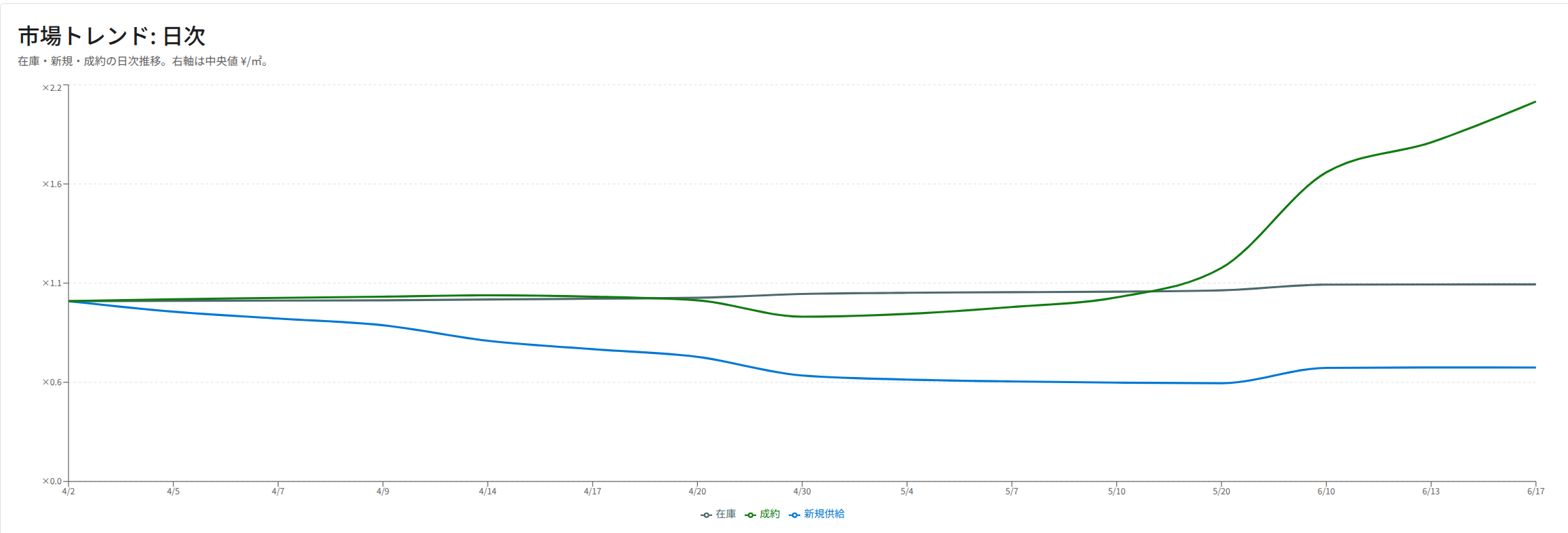
Market trend · dailyNew supply
Daily trend of inventory, closings, and new supply
Daily trend of inventory, inferred closings, and new supply. You can follow the market's momentum over time.
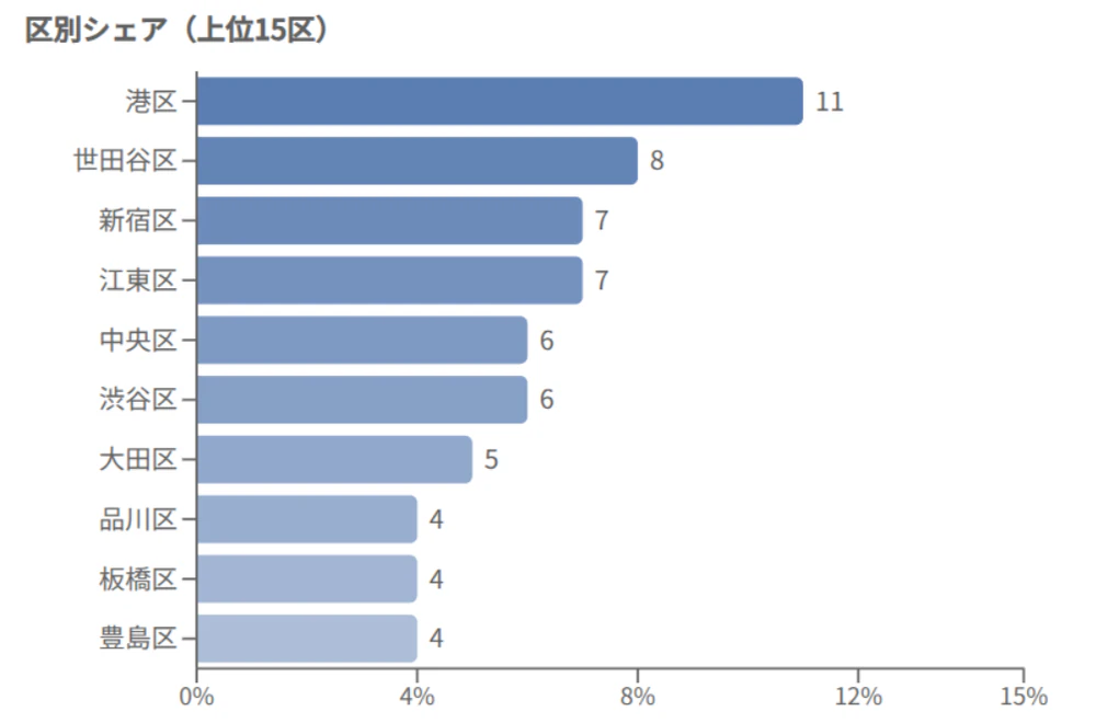
New supply share by ward (top)By ward
Ranking of new-supply share by ward
Which wards new listings concentrate in over the snapshot window. The skew in supply is easy to read.

04 · Places × real estate

Turn street activity into a price signal.

Shops and venues opening or closing, the mix of categories, and review growth can run ahead of the property market. This puts both on the same axes.
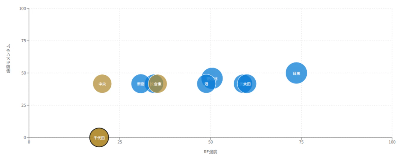
Health map · RE strength × facility momentumPlaces × RE
Bubble scatter of RE strength versus facility momentum by ward
Top right is where real estate and facilities are strong together. Top left is where the facility side may be running ahead.
  • Health map: place wards by RE strength and facility momentum.
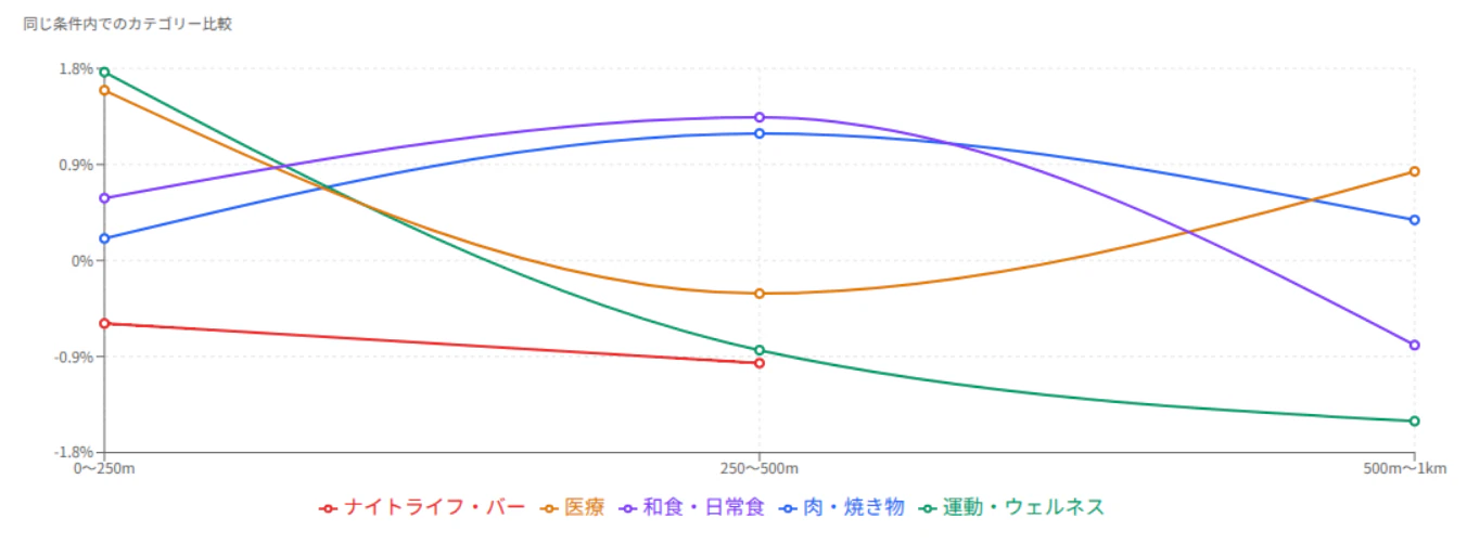
  • Category read: see which categories over- or under-index by distance band.
  • Growth snapshot: check the change in Places as a period difference.
  • Leading signals: look for the facility side moving before prices do.
Category comparison, like for likeCategory signal
Line chart of business category over- and under-supply by distance band

Who it's for

Detail that holds up to a real decision.

Investors and funds

Compare town-level yield, supply and demand, price structure, and area quality, and build a shortlist you can defend.

Investor screener

Developers

Weigh expected rent, land price, local demand, and how mature a neighbourhood is before you build or buy.

Neighbourhood intel

Brokers and operators

Turn price tiers, comparable areas, and Places momentum into something you can walk a client through.

See use cases

Try the public analytics first.

See part of the market structure before you log in. Do the deeper comparison inside the platform.