What does a 1LDK cost across Tokyo? Comparing the central wards with Katsushika
A single average cannot answer the question, "What does a 1LDK cost in Tokyo?" Once we keep the layout fixed and compare all 23 wards, the usual asking-price bands differ by more than three times.
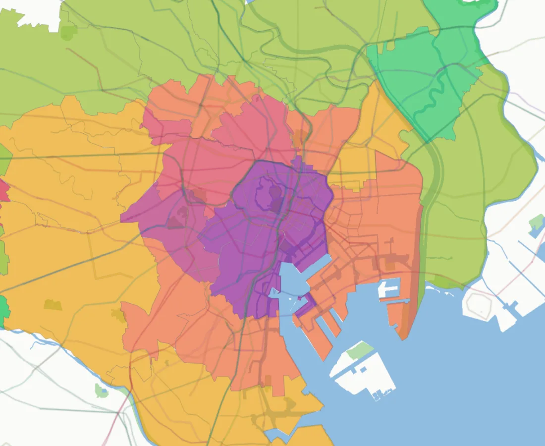
The three central wards sit in the ¥80 million to ¥90 million band
Minato, Chiyoda and Chuo all fall in the ¥80 million to ¥90 million band for advertised 1LDK homes. Shibuya follows at ¥70 million to ¥80 million, while Shinjuku and Bunkyo sit at ¥60 million to ¥70 million. On the map, the higher-price wards form a clear cluster around central Tokyo.
Katsushika is in the ¥20 million to ¥30 million band. Itabashi, Edogawa, Nerima, Arakawa and Adachi are in the ¥30 million to ¥40 million band. Comparing the midpoint of the highest and lowest bands gives a difference of about 3.4 times.
| Ward | Typical advertised band | Observations |
|---|---|---|
| Minato | ¥80m to ¥90m | 3,204 |
| Chiyoda | ¥80m to ¥90m | 381 |
| Chuo | ¥80m to ¥90m | 1,328 |
| Shibuya | ¥70m to ¥80m | 2,383 |
| Shinjuku | ¥60m to ¥70m | 1,896 |
| Bunkyo | ¥60m to ¥70m | 825 |
| Setagaya | ¥50m to ¥60m | 1,342 |
| Adachi | ¥30m to ¥40m | 324 |
| Katsushika | ¥20m to ¥30m | 274 |
Observation counts include repeated checks of the same advert on different days.
The layout is the same, but the homes are not identical
Keeping the layout at 1LDK does not make floor area, building age, walking distance or building quality equal. So we should not read the whole gap as the price of the address alone. The useful point is simpler: buyers start in very different price ranges depending on the ward.
In the three central wards, buyers are often paying for quick access to work, several railway lines, an address that is hard to reproduce and a home that may be easier to resell. Farther east and north, the same budget can often buy more space, a newer building or a shorter walk to the station.
It is tempting to stop here and say that central Tokyo is overpriced or that the eastern wards are always better value. The data does not support such a simple conclusion. A buyer choosing a small central home may care most about a short daily commute. Another buyer may prefer more space for working from home. Someone planning to move again in a few years may care about how easily the home can be sold. The price gap reflects several different choices, not just a ward name.
Observation counts tell us how carefully to read each band
The last column in the table matters. Minato has 3,204 observations, Shibuya 2,383 and Shinjuku 1,896. Katsushika has 274 and Adachi 324. A large set of observations is less likely to be moved by a few unusual luxury homes. A smaller set can change more when the mix of advertised homes changes.
These are not exact counts of unique properties. We may observe the same advert again on another day, so the figures are totals across observation days. They still help us see where the evidence is thick and where a price band needs more caution. Reading the band and the observation count together is much safer than treating every ward colour as equally certain.
The map tells a different story at ¥30 million, ¥60 million and ¥90 million
With a budget near ¥30 million, Katsushika overlaps the usual band. The three central wards do not. Reaching central Tokyo at that budget would normally require changing another condition, such as accepting a smaller layout, an older building or a longer walk from the station.
At ¥60 million, the search opens up. The budget is near the lower edge of the main band in Shinjuku and Bunkyo. It also overlaps the ¥50 million to ¥60 million band found in Setagaya, Taito, Shinagawa, Koto, Meguro and Toshima. This does not mean every 1LDK in those wards is affordable. Stations and neighbourhoods inside a ward still differ sharply.
At ¥90 million, the main band in the three central wards becomes reachable. The question then changes from "Can I buy there?" to "What do I want for the same money?" One buyer may choose a central address. Another may choose more floor space or a newer building elsewhere. The map is useful because it makes that choice visible.
Ask what your budget buys in each ward
This is more useful than simply ranking wards from expensive to cheap. With a ¥60 million budget, the main 1LDK band in the three central wards is usually out of reach. The same budget reaches the edge of the usual range in Shinjuku and Bunkyo, and sits near the main range in Setagaya, Taito and Shinagawa.
What the ward map cannot tell you
The map does not include monthly building fees, reserve funds for future repairs, interior condition, views, floor level or the quality of building management. A lower asking price does not always produce a lower monthly cost. A building facing major repairs can also require more cash after purchase.
The 1LDK label does not fix the floor area either. A 35m² home and a 55m² home can both be called 1LDK. If one ward tends to have larger 1LDK homes, part of its higher band may simply reflect that extra space. Once you find a promising ward, compare price per square metre and keep building age and station distance within a similar range.
A practical way to use the map
- Start with the 23-ward view and choose three to five wards near your budget.
- Open the smaller neighbourhood view and compare places near and far from the main stations.
- Keep floor area and building age within a range that suits you.
- Add monthly building and repair-reserve fees to the mortgage cost.
- Compare several similar homes and ask why any one advert sits far above or below the others.
This order helps prevent two common mistakes. The first is beginning with one famous station and missing workable alternatives. The second is comparing a cheap home with a more expensive home that has completely different size, age or access.
You can move from the ward view to smaller neighbourhoods on the Tokyo 1LDK purchase-price map. The ward colour is a starting point. Building age and station distance still matter when you compare real homes.